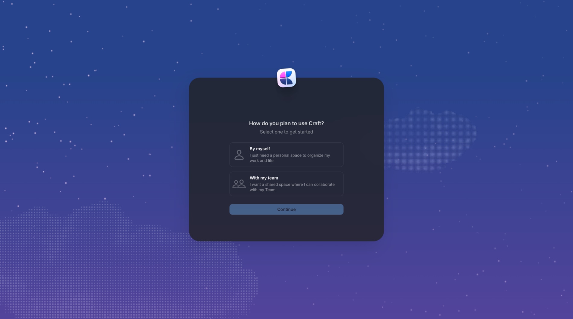
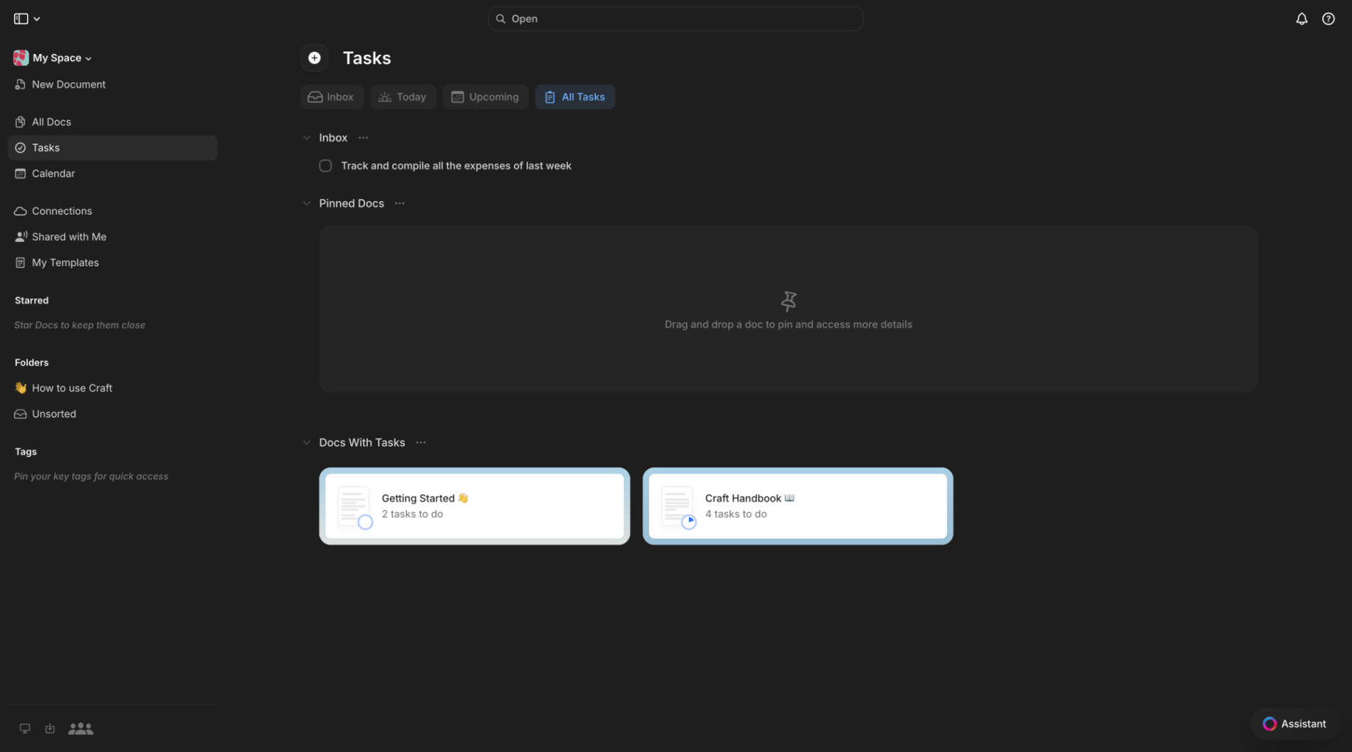
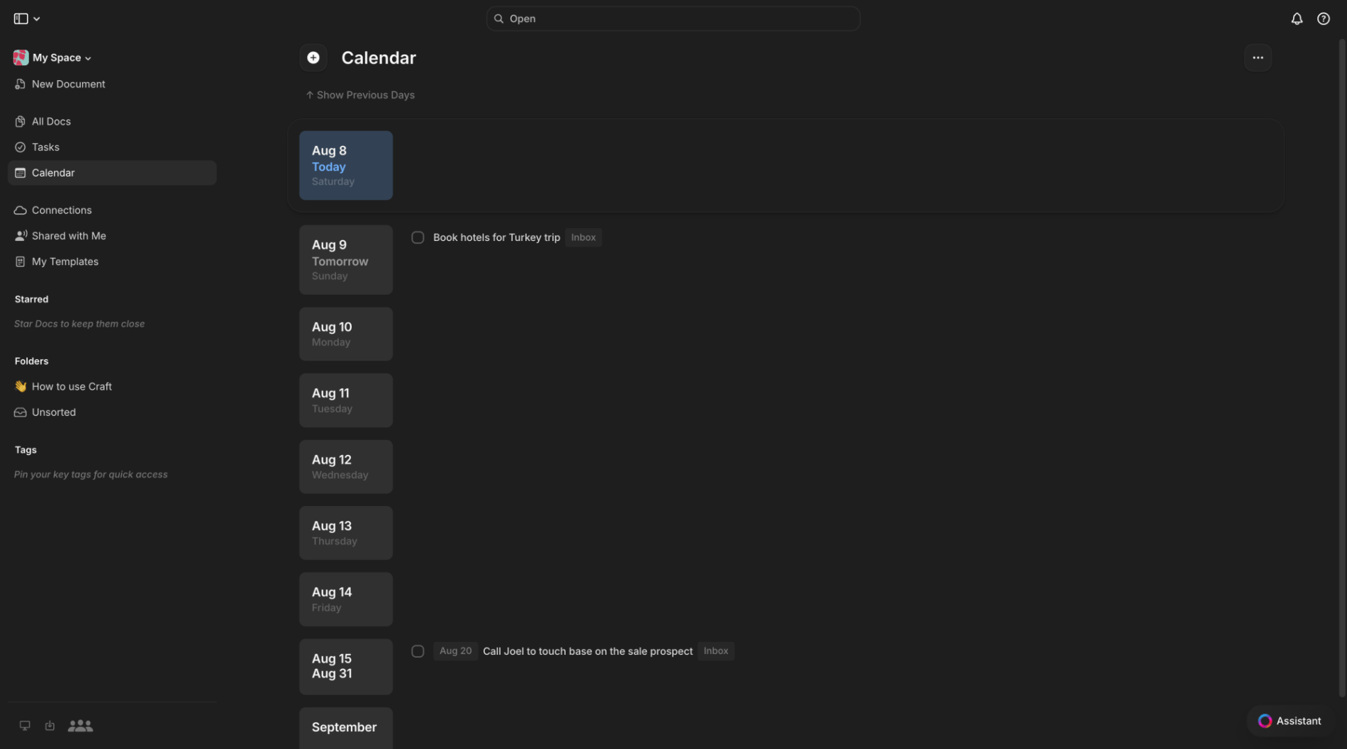
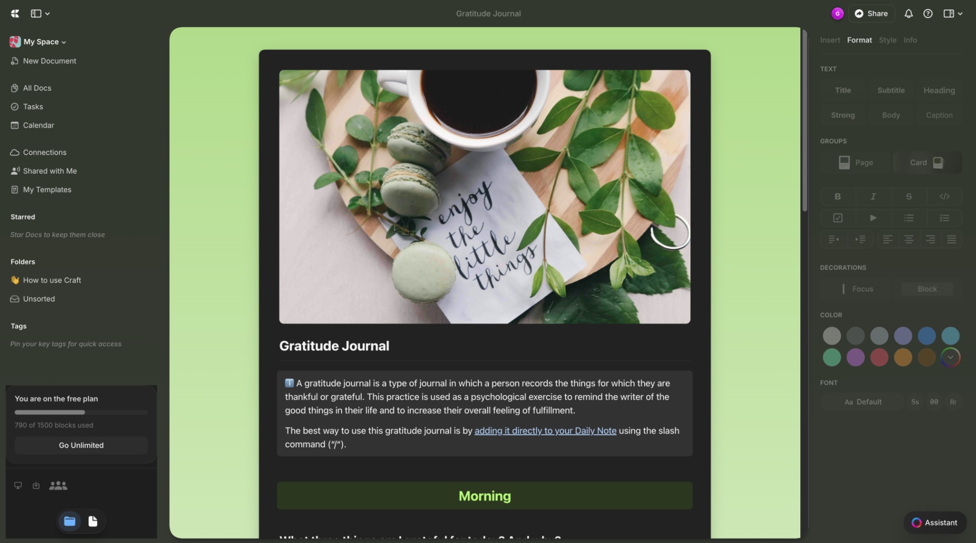
This is the first onboarding screen after account creation, asking the user to declare whether they'll use Craft solo or with a team. The single binary choice determines how the rest of setup and the workspace itself gets configured, and a Continue button gates progress until one option is picked.
Choice Architecture
Behavioral & Decision Making
- The entire screen exists to force one binary decision that branches all downstream personalization.
- Presenting exactly two symmetric, mutually exclusive cards with a one-line justification each makes the trade-off legible without needing a longer explanation of what each path unlocks.
- the two selectable option cards, 'By myself' and 'With my team'
- The framing is clear and the cards are well-balanced, but the low-contrast Continue button doesn't strongly signal that a selection is required before it activates.
Hick's Law
Cognitive Load & Information Processing
Aesthetic-Usability Effect
Perception & Visual Processing
MotiveThe user just finished signing up and has not yet seen any real product surface — this is the first substantive decision Craft asks them to make.
ObjectivePick the option that matches how they intend to use Craft so setup can continue.
MindsetOrientingEvaluating
Insight- Two symmetric cards with a one-line justification each let users decide by scanning rather than reading, which a dropdown or radio list here would not have achieved for the same information.
- Placing 'By myself' as the first, top card nudges toward individual accounts even though team seats are typically the higher-value conversion path — a default worth contesting.
Tension- Forcing a single either/or split at the very first screen speeds up personalization logic downstream, but it asks for a commitment before the user has experienced any of the product's actual value.
onboardingpersonalizationbinary-choicefirst-runmodal