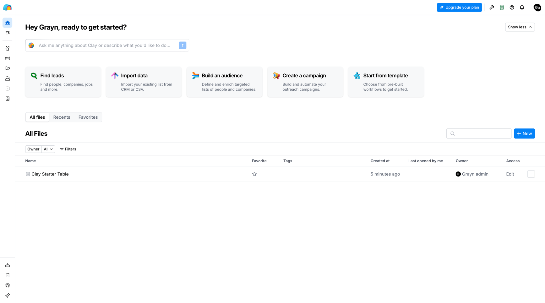
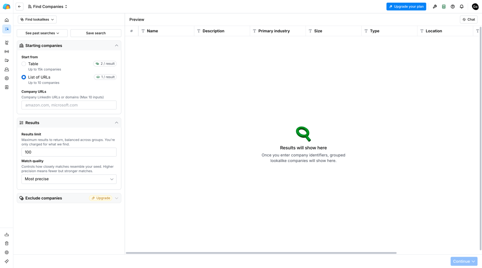
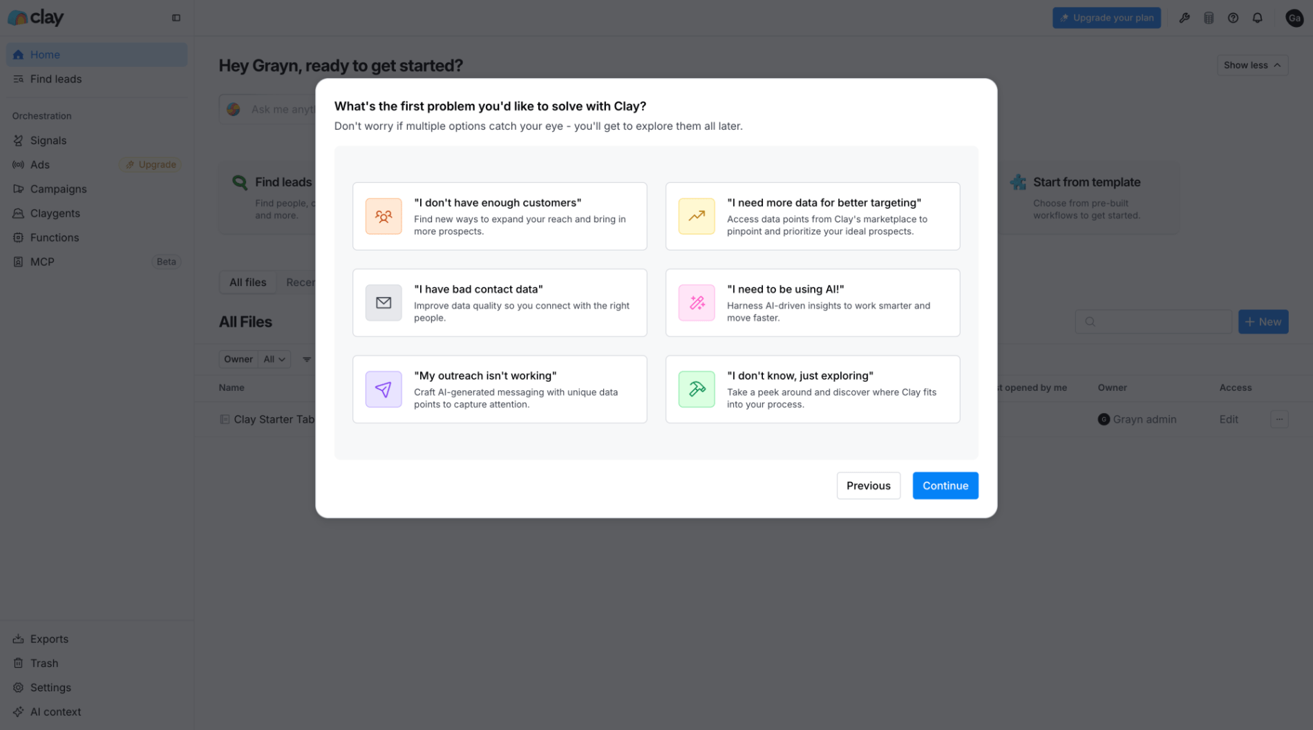
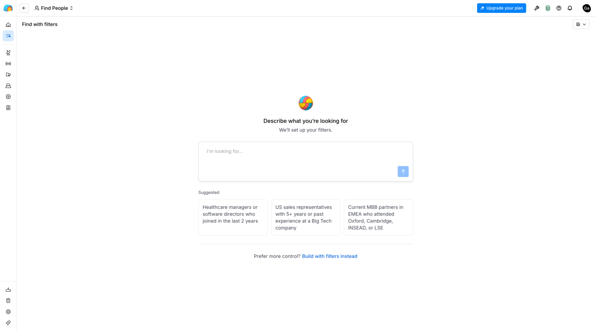
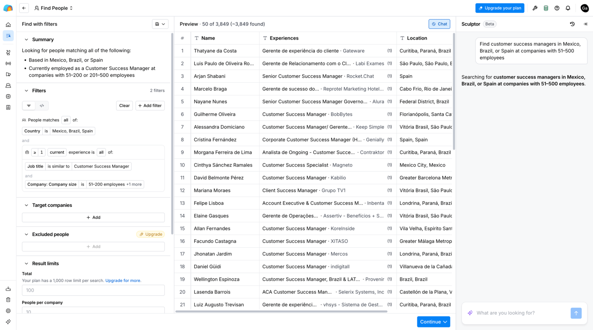
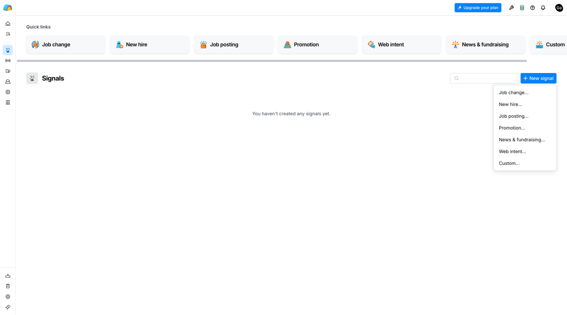
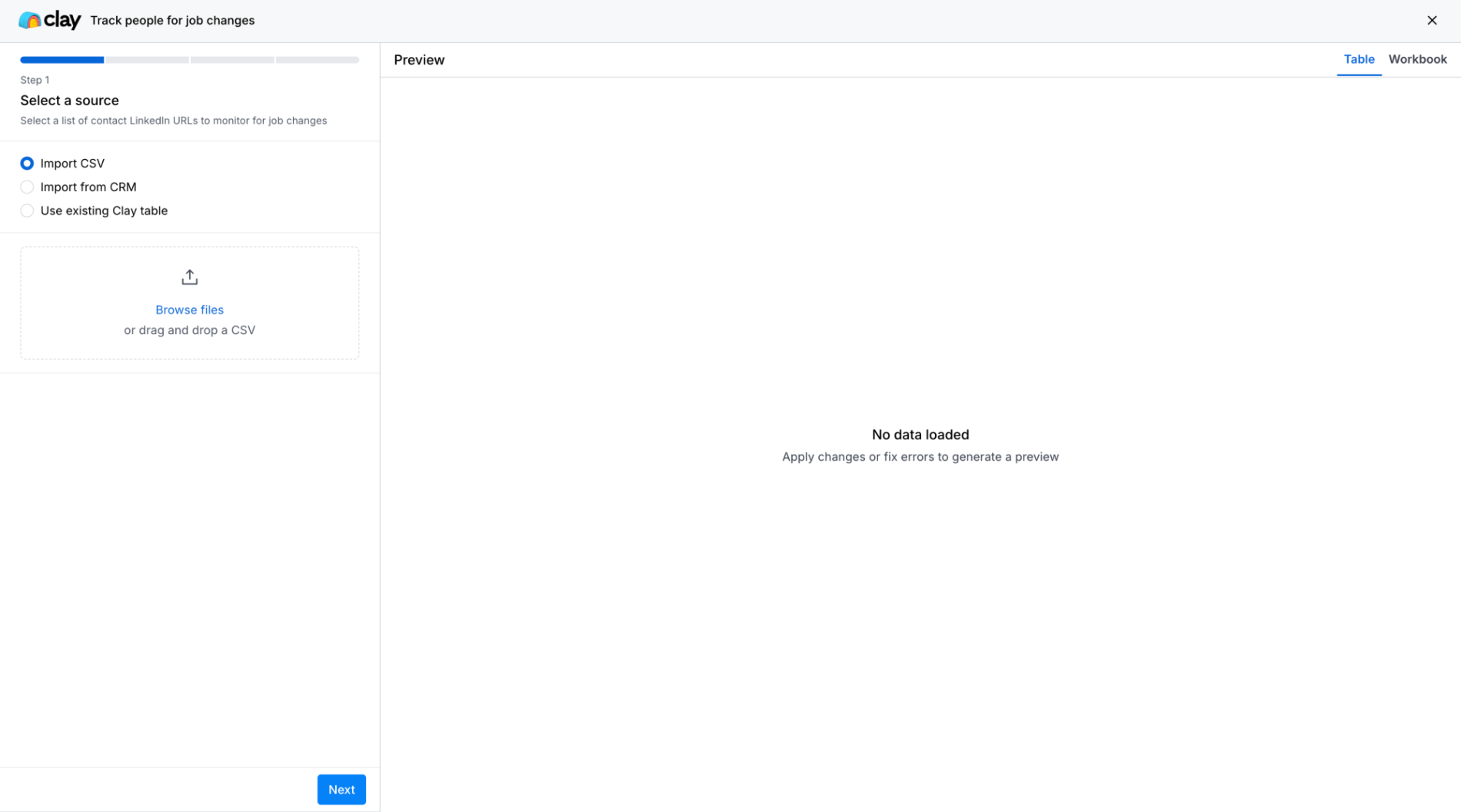
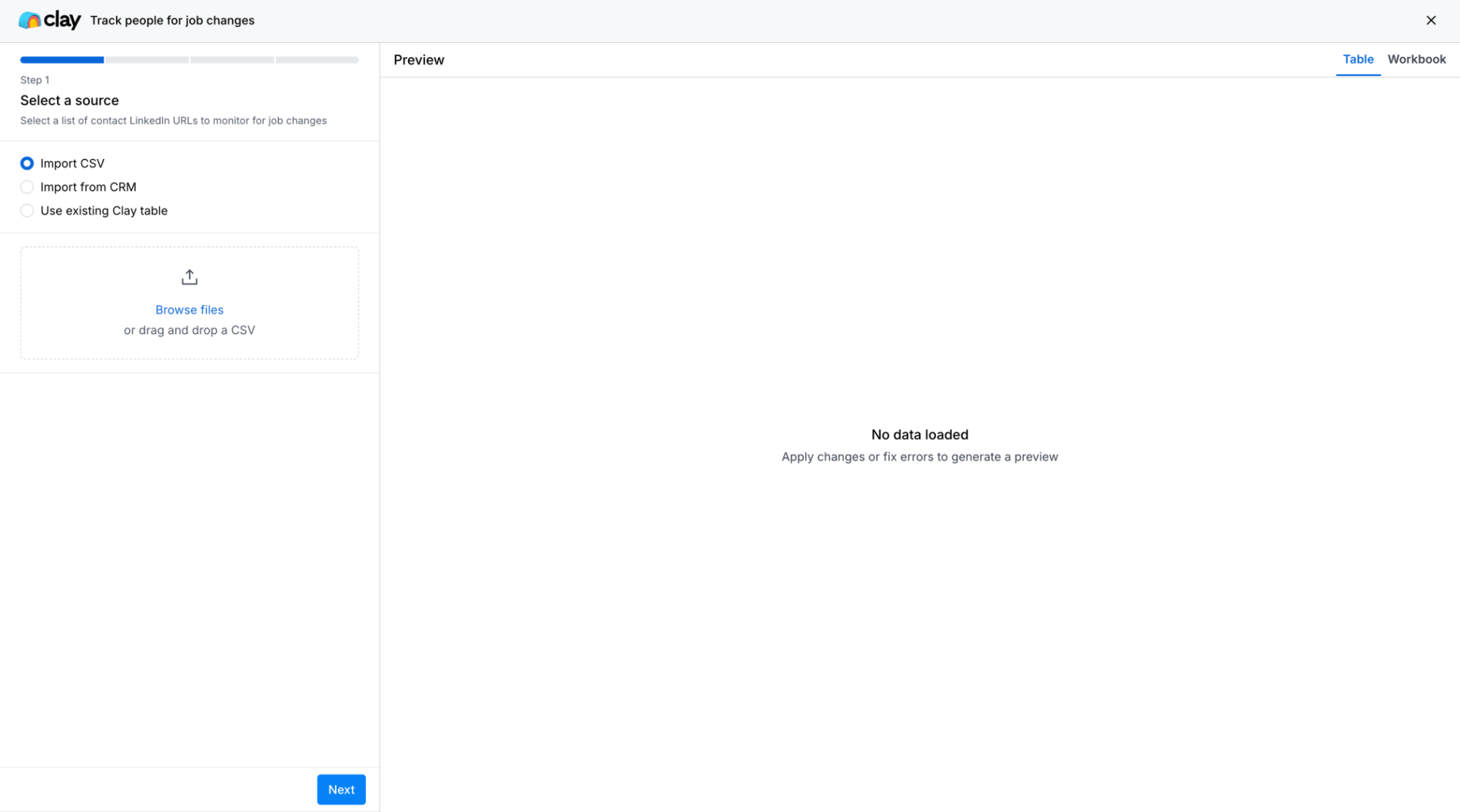
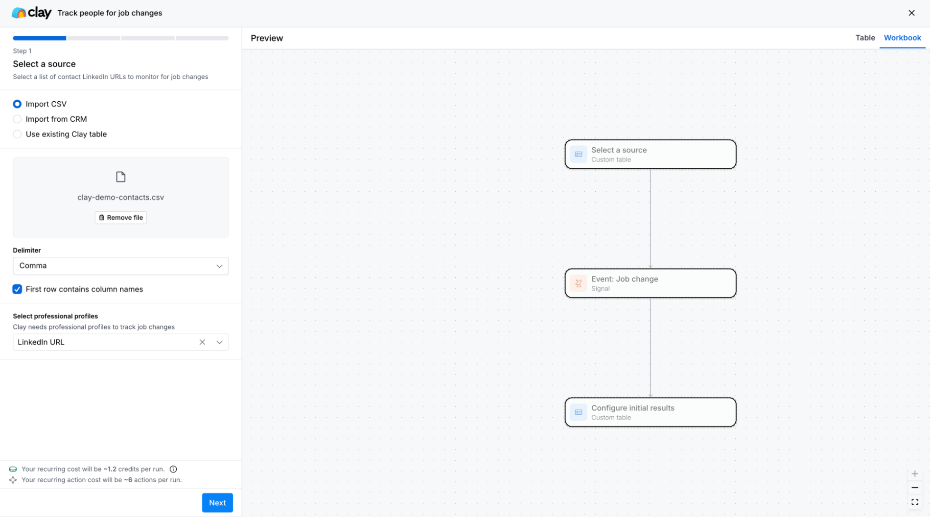
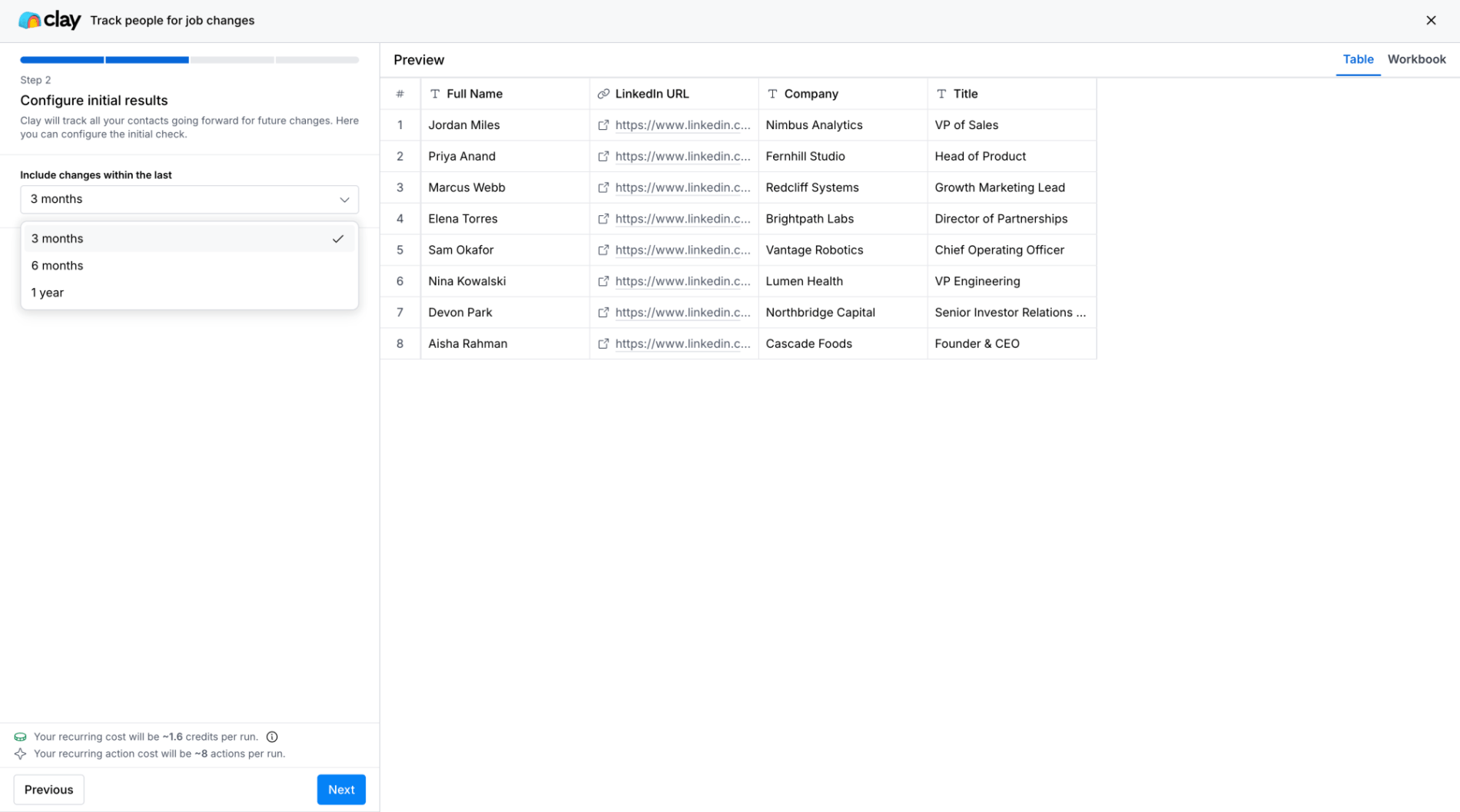
This is Clay's home screen, serving as the primary hub where users land after logging in. The screen combines a conversational AI input prompt at the top with five distinct action cards (Find leads, Import data, Build an audience, Create a campaign, Start from template) that represent core product capabilities, and a file list below showing the user's existing tables and projects. This hub gives new and returning users multiple entry points into the product's main workflows.
Choice Architecture
Behavioral & Decision Making
- The entire screen architecture is designed to structure choice, presenting five distinct entry points as equal-weight options rather than a single default path.
- Each card names a specific job-to-be-done with accompanying micro-copy, reducing the burden of translating product features into user intent.
- The layout positions these choices prominently above existing files, establishing them as the primary decision point rather than relegating 'what to do next' to buried navigation.
- The five horizontally arranged action cards (Find leads, Import data, Build an audience, Create a campaign, Start from template)
- Strong differentiation between choices and clear job framing, though the equal weighting may slow users who have a dominant workflow.
Progressive Disclosure
Cognitive Load & Information Processing
Wayfinding
Flow & Navigation
MotiveThe user has just logged into Clay, either as a new user evaluating the product or a returning user resuming work after absence.
ObjectiveDecide which workflow to start or which existing file to resume working on.
MindsetOrientingEvaluating
Insight- Organizing by job-to-be-done ('Build an audience') rather than product feature ('Tables') reduces the translation cost for new users but can slow expert users who've already formed their own mental shortcuts and want direct object access.
- The file list below the action cards creates a hidden bias toward resuming existing work rather than starting new workflows, which may be intentional stickiness but works against the 'ready to get started?' framing above it.
- Placing the AI input field first implies it's the preferred entry method, but giving it minimal vertical space and no example queries signals the opposite — revealing tension between conversational aspiration and structured workflow reality.
Tension- Offering five parallel entry points democratizes access to all workflows but forces every user to re-evaluate the same decision on every visit, rather than learning and optimizing a primary path over time.
- The conversational AI input field at the top promises open-ended capability but competes for attention with the structured action cards, creating uncertainty about which entry method is 'correct' for a given task.
onboardinghome-hubmulti-entryworkflow-launchercrm