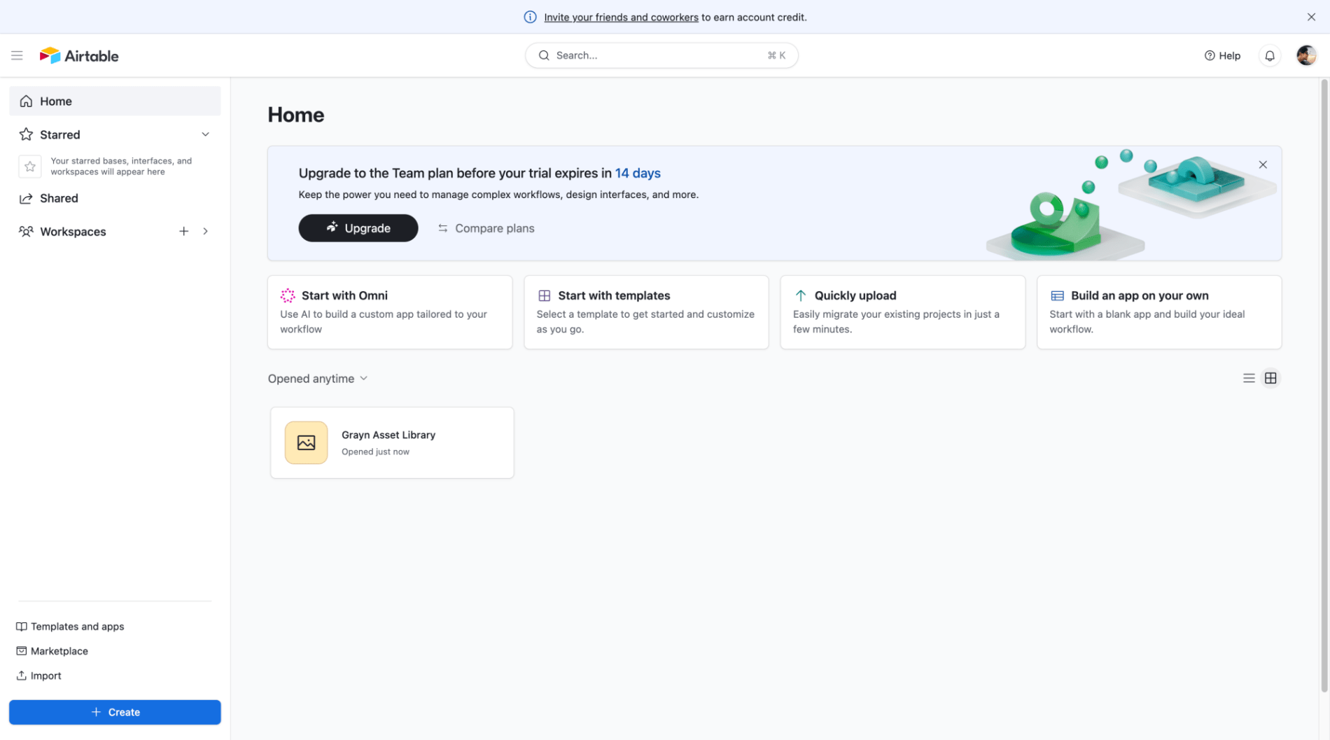
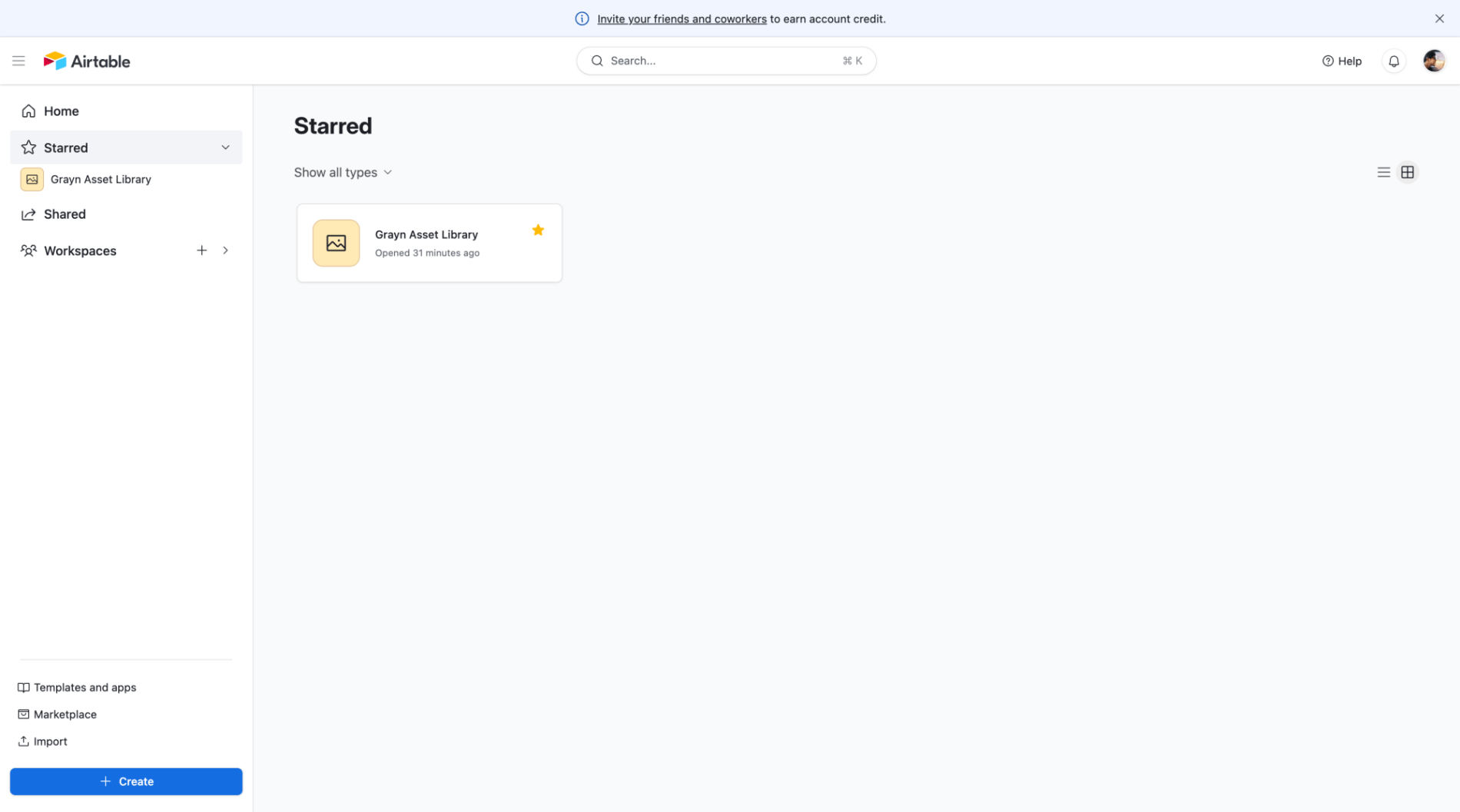
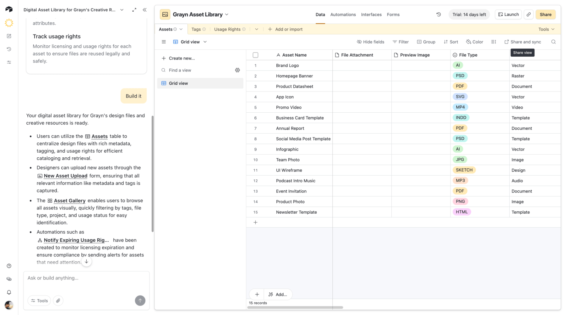
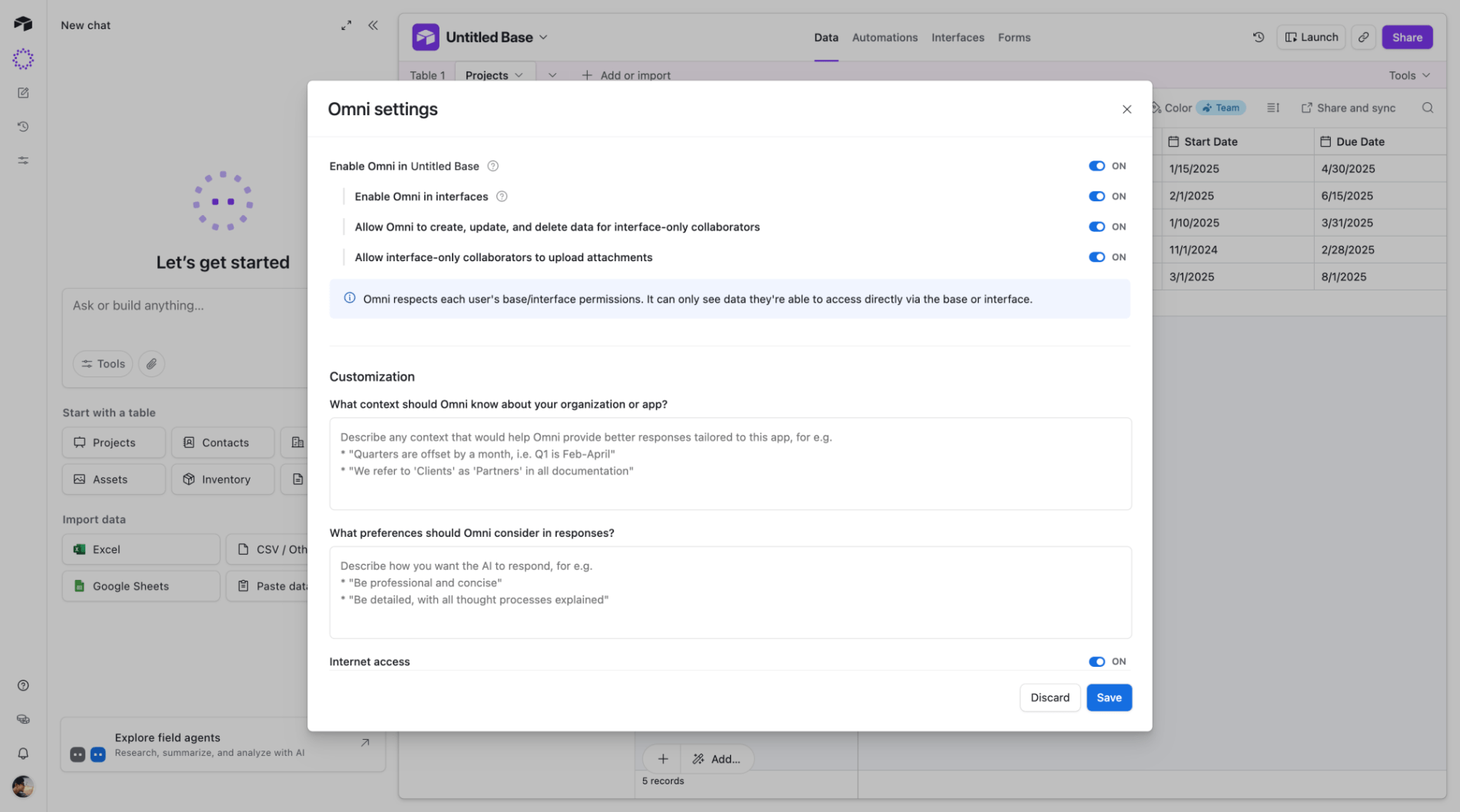
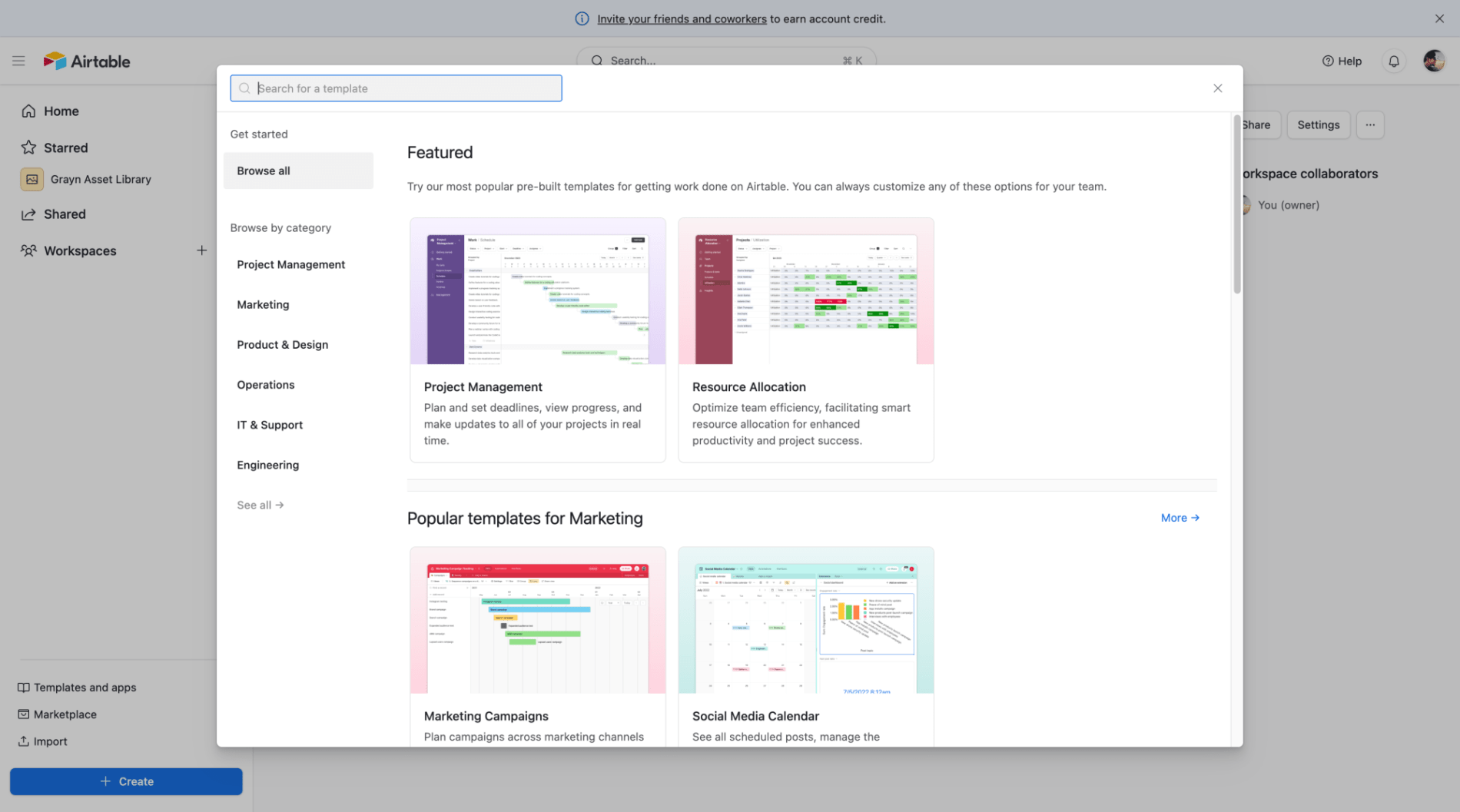
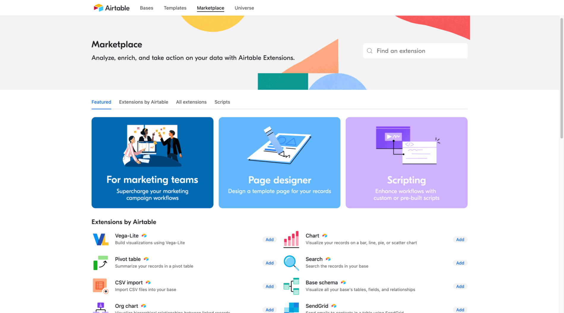
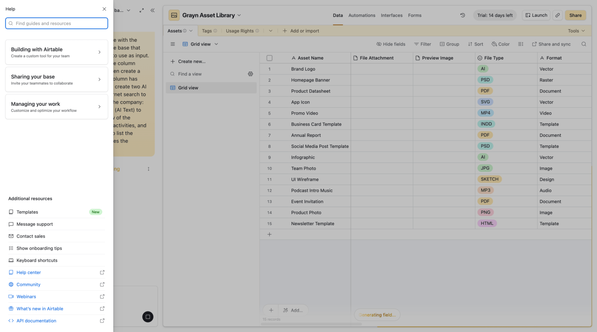
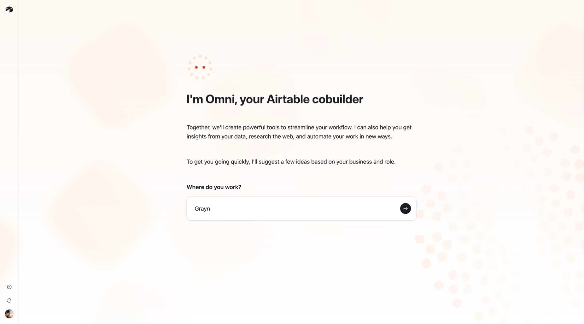
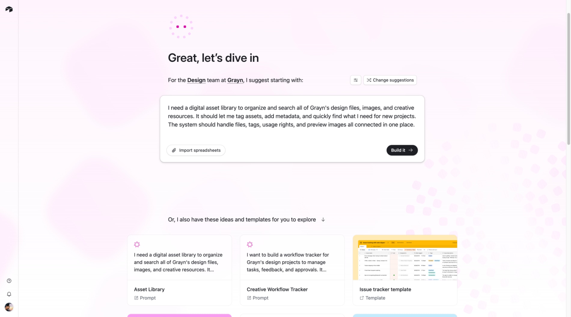
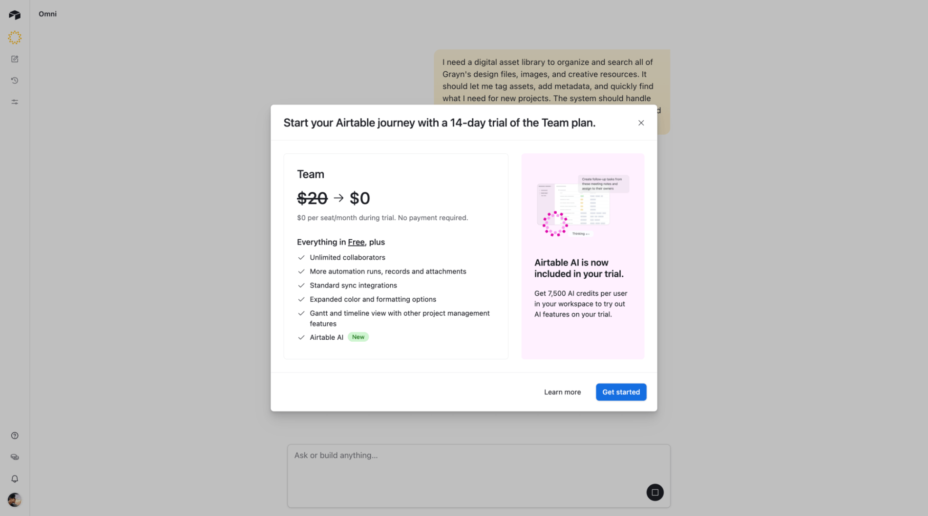
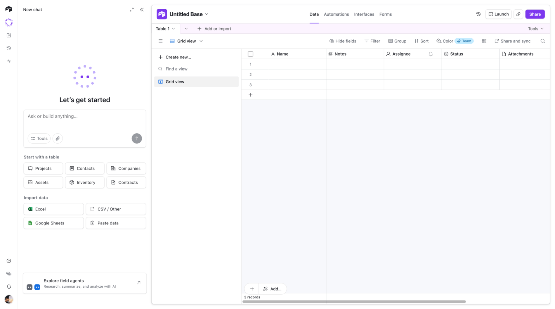
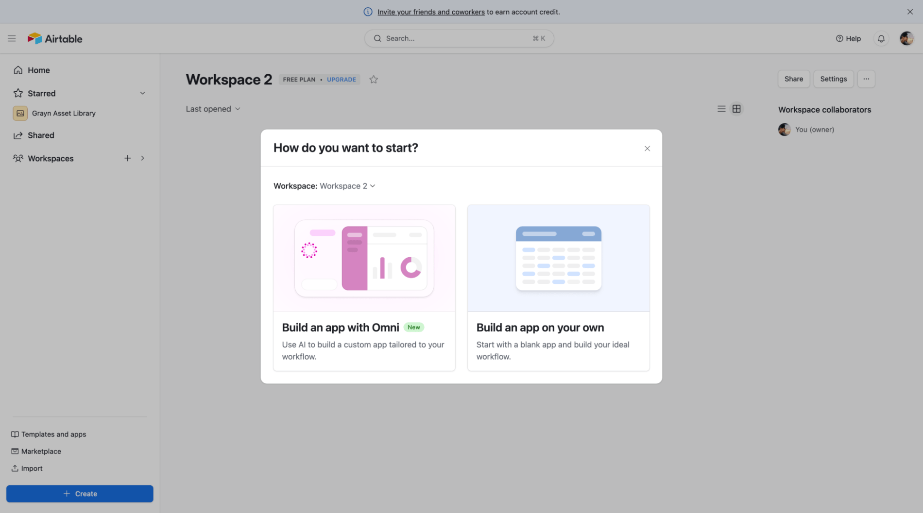
This is Airtable's home screen, the primary landing page after login. It presents users with multiple paths to start working: using AI to build a custom app, selecting from templates, uploading existing projects, or building from scratch. The screen also displays recently opened bases and surfaces an upgrade prompt for trial users approaching expiration.
Wayfinding
Flow & Navigation
- The screen structures navigation around four distinct entry points, each with clear labels and descriptions that map to different user intents and skill levels.
- This is a classic wayfinding pattern for a home screen — it doesn't force a single path but instead provides clear signposting based on where the user wants to go and what they already have.
- The layout acknowledges that users arrive with different contexts: AI-assisted creation, template-driven start, migration from existing work, or blank slate building.
- The four horizontally arranged cards: Start with Omni, Start with templates, Quickly upload, and Build an app on your own
- The four options are well-differentiated and the descriptions clarify intent, though the hierarchy between them is flat rather than guiding users toward an optimal path.
Progressive Disclosure
Cognitive Load & Information Processing
Paradox of Choice
Cognitive Load & Information Processing
MotiveThe user has just logged into Airtable or clicked the Home link in the navigation, returning to the central hub of their workspace.
ObjectiveChoose how to begin working, whether by opening a recent base or starting something new.
MindsetOrienting
Insight- Home screens for tools with diverse user intents benefit from explicit choice architecture over a single default flow — but only when each option's description clarifies when to choose it, not just what it does.
- The 'Quickly upload' option is the only one with a time-based value proposition ('just a few minutes'), acknowledging that migration friction is a distinct barrier from learning curve.
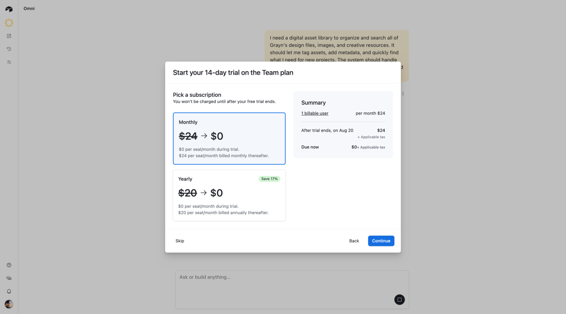
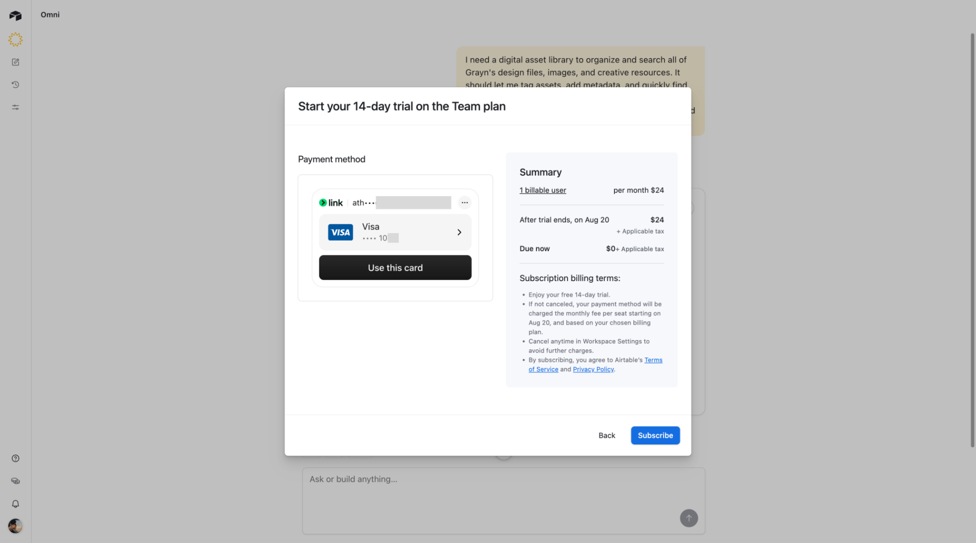
- Trial countdown messaging works best when paired with an immediate escape hatch — here, the 'Compare plans' link prevents the urgency from feeling like a dead end.
Tension- Presenting four equal-weighted entry points maximizes flexibility for different user types but sacrifices the ability to guide uncertain users toward the statistically optimal path.
- The upgrade banner claims valuable above-the-fold space to drive conversion but competes for attention with the primary wayfinding task, potentially delaying the user's first productive action.
home-screenonboarding-pathstrial-conversionmulti-entry